HealthTech Connect
Service Design | Mobile Interface Design
Tools
Figma, Miro, Mural, Photoshop, Illustrator
Concept
Improve the waiting room experience
Timeline
Feb. - June 2023
Team
Yena Kim, Tess Dziallo, Mathias Moslehi
My Role
Researcher, Concept Development, UI Designer,
Project Manager

Challenge
In our service design class we were tasked with finding ways to improve the waiting room experience so that patients feel more in tuned to the service they are waiting for. My team decided to perform research at local medical facilities like the Los Angeles General Medical Center (formerly LAC + USC) and Kaiser to design a solution for the issue patients face.
Problem
Through our research we identified that many waiting rooms often get crowded due to the lengthy documentation of intake and symptom forms which result in delays. As a result patients often feel anxious and rushed through their appointment. This often leads to them feeling like they aren't receiving optimal care.
Solution
A digitized onboarding process that streamlines doctor visits for patients and medical personnel. Providing patients with access to information before their visit, such as maps, doctor bios, symptom forms, and intake forms, reduces anxiety and saves time spent on paperwork at the office. It also encourages early communication between patients and doctors.
How can LA General Medical Center give new patients the quality of service they deserve while building trust, fostering empathy and empowering them to feel seen?

Why are patients feeling overlooked?
We began by conducting desk research and compiling a list of peer reviewed studies regarding wait times at hospitals. We found that most focused on urgent care and ER and that there is correlation between long wait times and overall negative patient experiences.

When patients are informed about the delay of care, they feel less frustrated and angry


Having better communication flow between nurses and doctors in terms of what stage of the appointment process a patient is in decreases wait times
We found major insights
1.
Communication within staff and patients is important to maintaining satisfaction.
2.
Building trusting relationships between care givers and patients yields positive feelings on future visits.
3.
Identifying bottlenecks within organizations can prove beneficial.
Talking to patients and observations leads to great information
From our field observation at Kaiser and Los Angeles General we noticed that frustration for patients can start even from the parking lot. If outside signage and indoor directories are not clear then patients can become confused and irritated.


We were surprised to learn that...
1.
Getting to the LAC + USC hospital from the parking lot was confusing.
2.
People like being greeted and directed to where they are supposed to go.
3.
Kaiser Permanente provides two different check in systems: kiosk and front desk to mitigate backlogs.
Getting to the root of the problem required talking to Doctors

Dr. Martinez
Kaiser Permanente
"The most consuming part of a patient's visit is recording their vitals such as temperature, pulse rate and blood pressure. If patients are late to their appointment it triggers a cascade effect."
We got an opportunity to interview Dr. Martinez at Kaiser, we discovered that recording a patient's vitals is the most time consuming part of their visit. Delays can occur when patients arrive late for their appointment and can result in rushed doctor consultations. Staff shortages worsen this backlog.
Many patients like Evelyn feel rushed through their appointment
From multiple research and observations we formulated our persona Evelyn, a 62 year old patient who was referred to the Los Angeles Medical Center by her friend. She has high hopes of finding a provider that will help her with her lymphedema ailment.
.png)
Identifying paint points for Evelyn
By creating a patient journey map of Evelyn's experience at her doctor's visit we were able to identify multiple pain points that started with getting to her appointment and ending without a follow-up. We also brainstormed opportunities to help alleviate some of her frustrations such as giving her a an overview of what to expect before meeting with her new doctor.
.png)
What we explored
During the ideation stage we expanded on the opportunities we identified in the patient journey map. We narrowed down which idea to pursue by focusing on the moments that matter of Evelyn's journey. We then created three main concepts.

Information Deck
Pre-appointment
digital information deck emailed to patients prior to their visit

Mobile Update
Reimagined appointment management that notifies patients of their visit and gives them real time updates

Appointment Follow-Up
Post-appointment digital continuous contact with patients through their mobile device, voice texting enabled
Prototyping the Digital Information Deck
After presenting our concepts to our peers they noted they liked our information deck idea the best because it addressed patients' concerns before arriving to their appointment. We focused on adding a bio of the doctor, a virtual facility walkthrough and intake forms patients can fill out before arriving to their appointment. We then created a storyboard, wireframe and prototype in desktop and mobile format.
Features
1
Doctor Bio
The doctor bio will be in written and video format. This gives patients an opportunity to get to know their doctor before their appointment and helps
establish early communication between patient and doctor.
2
Facility Virtual Tour
The video will feature a walk through of the hospital building along with general guidelines. There's no more getting lost just trying to find directions upon arrival.
3
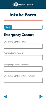
Intake Forms
Fillable intake forms provided to first time patients with guided instructions and a symptom check sheet. Helps prepare
patients in advance and thus reduces excessive waiting at the hospital.
What does a better journey for Evelyn look like?
.png)
Desktop Prototype
.png)
Mobile Prototype
.png)
Staying in line with the existing color scheme
.png)


What we tested
Because we didn't have access to hospital patients we tested our prototypes with our classmates. They preferred the mobile version and expressed that their parents are tech savvy and would easily navigate the mobile version.

Testing the information deck through desktop format

Testing the information deck through mobile format
Improving our designs

Before
One paragraph to onboard patients

After
Several screens to onboard patients, added a skip function and indicators at the bottom

Before
Progress bar was confusing and there was no back button
.png)
After
Converted progress bar to percent and added back and forward arrows

Before
Confusion with the word finished at the end of a section

After
Added a screen to indicate the section was complete and could be submitted
Getting feedback in real time
We got an opportunity to present our work at our student showcase at the end of the semester. We talked to industry experts to get their feedback on our project. The feedback was mostly positive with members telling us they liked the guided experience for new patients especially the bio video and facility tour which was a creative idea. Other experts would have liked to see us test it with actual patients.


Final Prototype

Digitizing the onboarding process for LA General
HealthTech Connect streamlines doctor visits for patients and medical personnel.
Providing patients with access to information beforehand, such as maps, doctor bios, symptom forms, and intake forms, reduces anxiety and saves time spent on paperwork at the office. It also encourages early communication between patients and doctors.
Patient Access to Information
Facilitating patient access to better information and educative tools provides them with greater benefits and satisfaction. It also speeds up the preliminary paperwork to reduce wait times.
Our solution guides patients through the required paperwork via a check list.


Relationship Building
Modern healthcare facilities emphasize the importance of building trusting relationships with their patients and as a result they score high among patient reviews.
Our solution establishes relationship building by introducing patients to their doctor via video.
Clear Facility Navigation
Our observations revealed that directions at the hospital were unclear and since it is a big facility it was easy to get lost.
Our solution gives patients access to a tour of the facility and a downloadable map.


Effective Communication
A common touch point for many patients is being more aware of the symptoms they are feeling and communicating them to their doctor.
Our solution makes it easy for patients to describe their symptoms via a list, body chart, audio message or photo.
What I learned along the way
Our concept can be adopted by large medical facilities to improve and digitize the onboarding process. By putting the patient’s need at the center of care, it can lead to greater satisfaction and improved communication. Making a difference in their daily lives.
Other areas that we researched and would design further in the patient journey include:
-
The physical waiting room experience
-
Personalized follow-ups to the appointment.
Although our project took multiple directions along the way our aim was to improve and streamline the journey for patients and medical personnel. To achieve this, we empathized with patients like Evelyn, identified their frustrations, and designed a system to address their specific needs. We emphasized the importance of service design, creating an efficient and user-friendly system. Additionally, we prioritized accessibility and inclusivity by using clear language, alternative formats, and user-friendly interfaces. Our goal is to create a human and humane healthcare experience that makes a real difference in the lives of patients and personnel.
